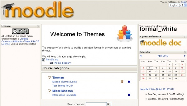
Moodle, the largest open source platform in the world, is stuck in our minds with its clean, linear and symmetrical graphic layout. Few people know that this graphic theme called “Formal White” was conceived and developed by Andrea Bicciolo, Director of Technology of MediaTouch.

The story
Between 2001 and 2002 Moodle expanded rapidly. At the time, the Moodle theme (colors, backgrounds, layouts) was not particularly developed. Therefore, volunteers started to propose some graphic themes but they present some critical issues, especially for adoption in organizational areas, such as universities and companies where the ability to easily scale the visual identity is required. It is therefore not easy for users to find a graphic theme that suits their needs.
The Formal White theme arrives
In 2004 Andrea Bicciolo created and developed a new graphic theme that could satisfy all the aesthetic and functional needs needed by users. Thus was born the Formal White theme which had three fundamental characteristics: enhancement of symmetry, easily customizable neutral colors and the possibility of serving as a basis for developing new themes.
A long-lived and Moodle’s core theme
Formal White immediately becomes Moodle’s core theme and it remains so until 2014. MediaTouch is its main maintainer. Formal White has become one of the most popular themes mainly because it allows users to create new ones, and it has helped to give Moodle the iconic look that we all know and with which we identify it.


